The Big Shift: How to Redesign Content-Heavy Websites Without Losing Your Mind
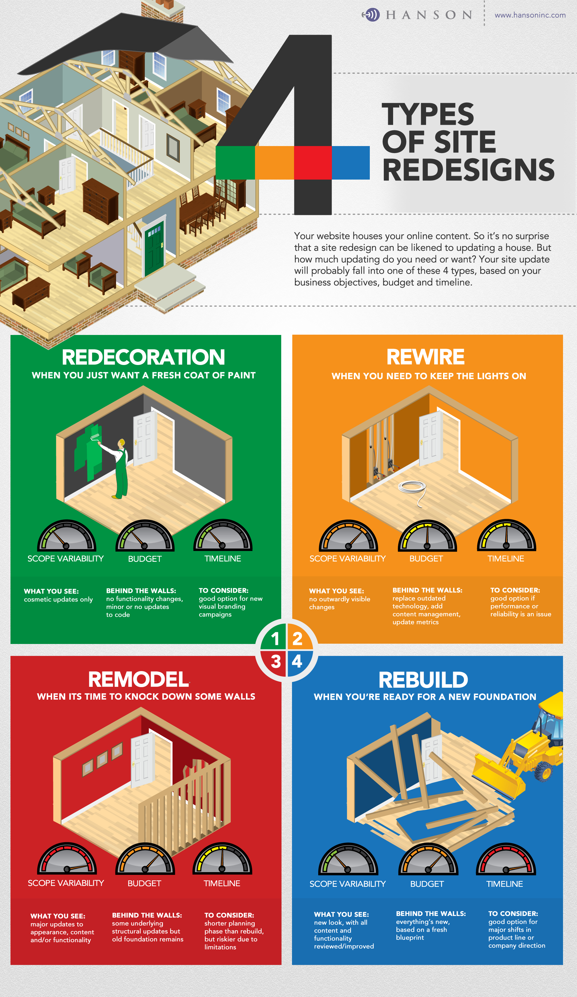
Struggling with a content-heavy website redesign? Discover three proven strategies—including AI-assisted migration—to simplify the process and create a better user experience.
Struggling with a content-heavy website redesign? Discover three proven strategies—including AI-assisted migration—to simplify the process and create a better user experience.
Read Insight