Why We Design The Home Page Last
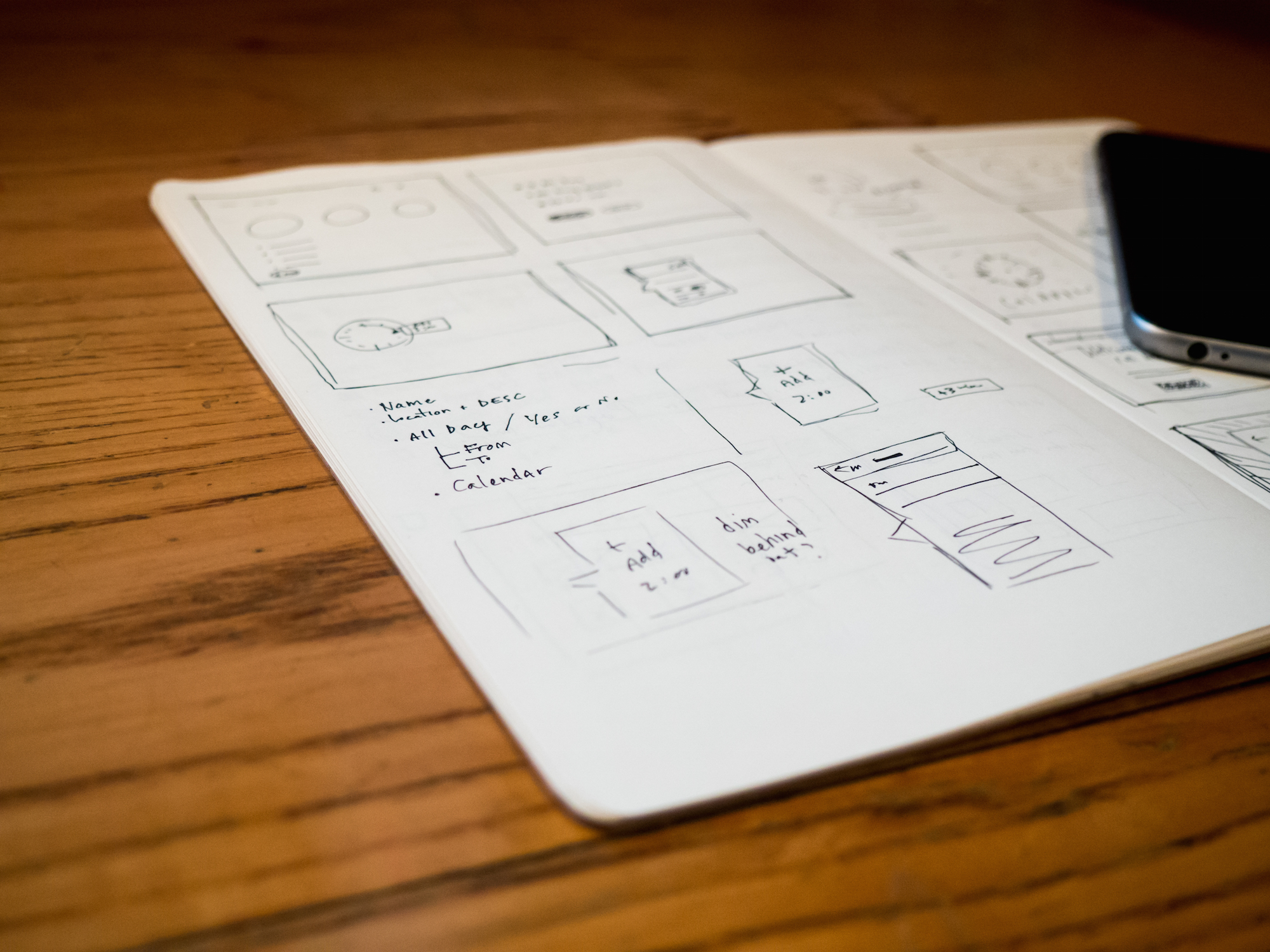
There’s no denying that the home page of a website is important. And it’s because of this importance that we believe it’s paramount to get the home page right before it’s revealed. Just like you don’t make a book cover or movie poster at the start of a project, you have to have the story (or in other words, each customer’s journey) in place beforehand.I’m reminded of countless times over dozens of web projects where there’s a strong expectation to see a home page design almost before anything else. There’s no question it will create an emotional response, but certainly no one would want that response to be negative. Obviously, it’s not impossible to create a home page early on, but the intent in waiting, to a great extent, is to limit confusion, misunderstanding, and conflicting revisions.Certainly, there are many different approaches to the web design process in the digital industry, but we’d like to make a case for designing the home page last.
Our approach
Our approach is simple:
- By solving complex pages and UI/UX first, we are in a much better position to create a home page (and other critical landing pages) that leads users to successful and satisfying visits—one that also makes sense the first time stakeholders see it.
- If we approach a home page as being fit for many types of users and audiences, it’s important that we can articulate how each of them sees the most optimal information. Without personas and journey maps (or at least site structure) at hand, it’s difficult to convey many and varied experiences.
- We keep in mind that the home page has to work on many different devices, so that adds a lot of complexity as well (kind of like designing a page layout to work on a brochure and a playing card).
Since stakeholders can’t yet see or easily experience a more complete site flow before the site is developed, seeing a premature home page design might lead to extra time spent by many, ruminating about issues that are all worked out before they ever leave a rough sketch. (Resolutions which we partially or fully anticipate, but can’t articulate easily, often for a lack of having those subpages that show how things work along the journey.) As is often the case, it’s much later in the project that we’ll know just what types of images, what types of content, and what message all works best to make a home page that can be shared far and wide (vs. lorem ipsum and simple image placeholders).
Breaking it down
DesignThe facts are clear—the home page, to the extent that it is the starting page for most visitors, must create brand-focused emotion and then quickly get the visitor on their way, since everyone comes for a reason.Keep in mind that visual design both engages and directs actions:
- Images, videos, messaging, and aesthetics impart the value of the company, but also convey the purpose and features of the site.
- Simple headers, combined with relevant information—like a link to “News” but also a few contextually important or interesting news articles, quickly lead different audiences or visit intents to different parts of the site.
UI/UX ExperienceThe home page also needs to fit within the overarching user experience architecture of the site. At the early phases of a project, the actual interface itself—the buttons, boxes, panels, text sizes, colors, etc., are not yet fully formed—they become developed as a variety of the most complex pages are imagined, planned, and iterated on. Lots of choices drive iterations that involve enhancing something drafted previously. UI elements that seem appropriate at the beginning might become unnecessary during the process, or evolve to accommodate previous unknowns.
The process itself writes the best story
In a much broader sense, the beautiful interworking of the digital design process is what drives the most exciting and powerful experiences to emerge. Through focused iteration cycles, more people from different roles begin to get involved and start to share in the vision and objectives for the project. Those people, from client services, strategy, experience design, visual design, front-end design, and engineering can all affect the outcome of the project in a great way due to everyone having specific strengths and experience. The most powerful solutions are generated as people iterate together, which they are more able to do as the project evolves.In lean and agile digital development, you might hear people talk about making decisions at the “last responsible moment.” The idea is one of risk avoidance, by not rushing to judgment. While the topic is debated heavily on both sides, it’s the sense that with incomplete information, it’s best to leave decision gaps here and there, as long as they don’t impede critical parts of the project. In another sense, these gaps can also be thought of like parts of a puzzle in progress—you always know when the puzzle is done, but you’re not forced to work top to bottom. A more technical way to say it is that we don’t want to just meet the spec; we want to make the best solution within scope.Over time, the conditions for creativity are put into place. To get the best and brightest and most innovative iterations, we have to leave gaps, discarding things along the way as new parts reveal simpler and better solutions to other parts.This all comes back to our approach: if you want the best, simplest, and most elegant experience with your site redesign overall, we’d recommend waiting to see the home page.